Stacey Lind Design

Welcome

Combining design elements, people, creativity and ideas to craft pieces with intent - that convey an idea, tell a story.

Have a scroll and check out some of my recent projects as creative director, designer, and photographer.


Bold and innovative

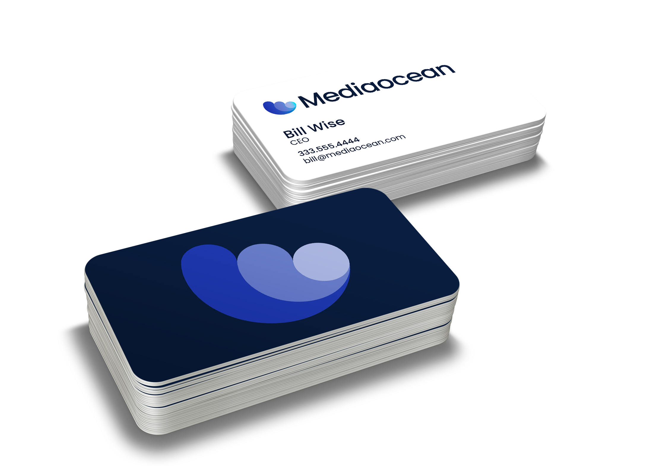
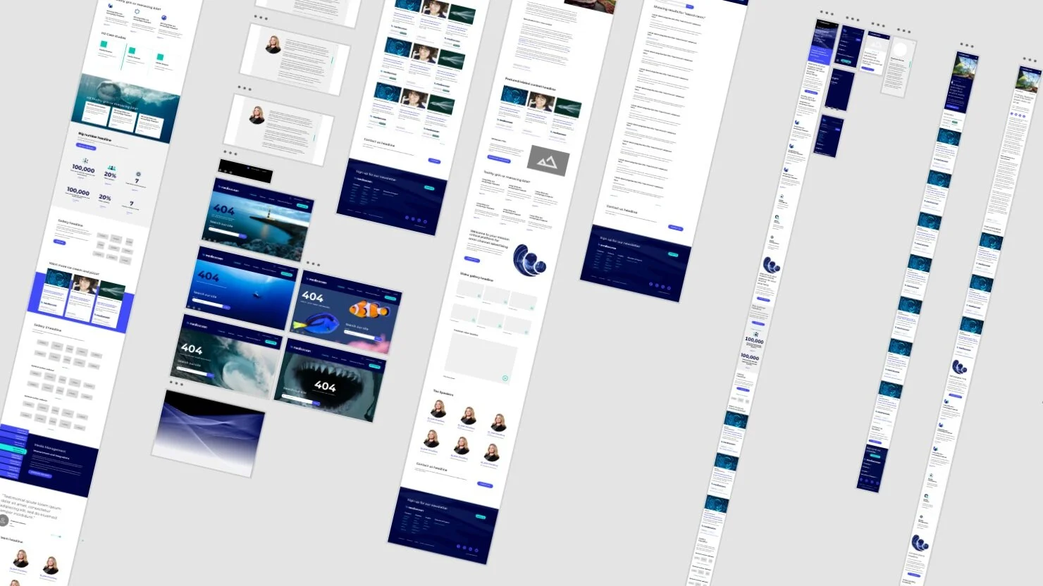
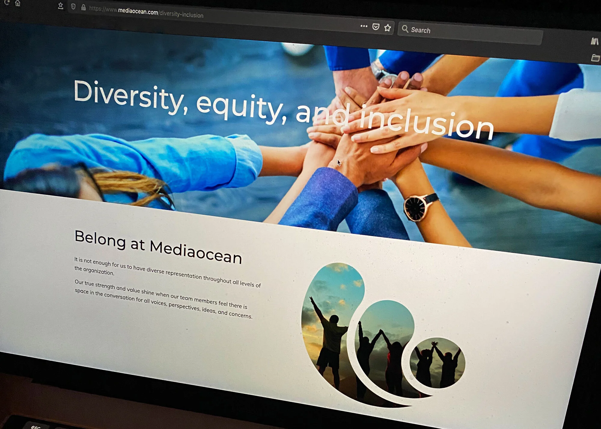
This eight-month visioning, product paradigm, and visual identity project directly followed Mediaocean’s acquisition of 4C and was designed to unify a sprawling product suite and refocus the attention on the corporate brand - a new Mediaocean that was bold, innovative, and future-focused.

The result: a clean new look that excited clients and employees alike, honored the history of the company, and set the tone for the evolution of the platform.

Creative Direction: Stacey Lind

Design: Morgan Alfrejd, Robbie Smolko, Stacey Lind

Web Development: Thomas Spinelli, and Clique Studios


jeremy-bishop-7JPerNWjEAE-unsplash.jpg
Scope_Reverse_400px.png

Product rebrand

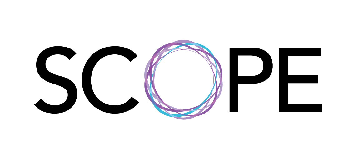
in 2018, the marketing technology created by 4C shared its name. Taken from the airplane seat where two of the original founders met, it provoked questions like, “What do the four C’s stand for?” The push to unify separate products and create an interoperable system opened the door for a new brand that would evoke the product functionality and distinguish it from the corporate identity. The name Scope suggests breadth and reach (cross-channel marketing activation at scale) as well as focus and examination (intelligence and analytics). After a campaign of consensus building, lots of focus groups (no, Stacey, you can’t make the O look like a gun sight), and multiple iterations, the new identity was launched.

The result: a distinct identity that worked in tandem with the 4C logo but stood on its own as the symbol of a unified, multifaceted product with a name to match.

Creative Direction: Stacey Lind

Design: Stacey Lind, Robbie Smolko

luke-chesser-hQo6Uyo4nBg-unsplash.jpg

Defy Gravity

Defy Gravity was the theme of 4C’s 2020 annual all-company kickoff event, in a period where much of our marketing thought leadership content used visual themes of space exploration and there was a company-wide campaign to push limits to refine our products.

Result: this inspiring event theme combined inspiration, interactivity, swag, and symbolism that employees could carry with them throughout the year.

Creative Direction: Stacey Lind

Design: Robbie Smolko, Raymond Hayen, Stacey Lind

ferenc-horvath-skcFiBu91AA-unsplash.jpg

Resident designer

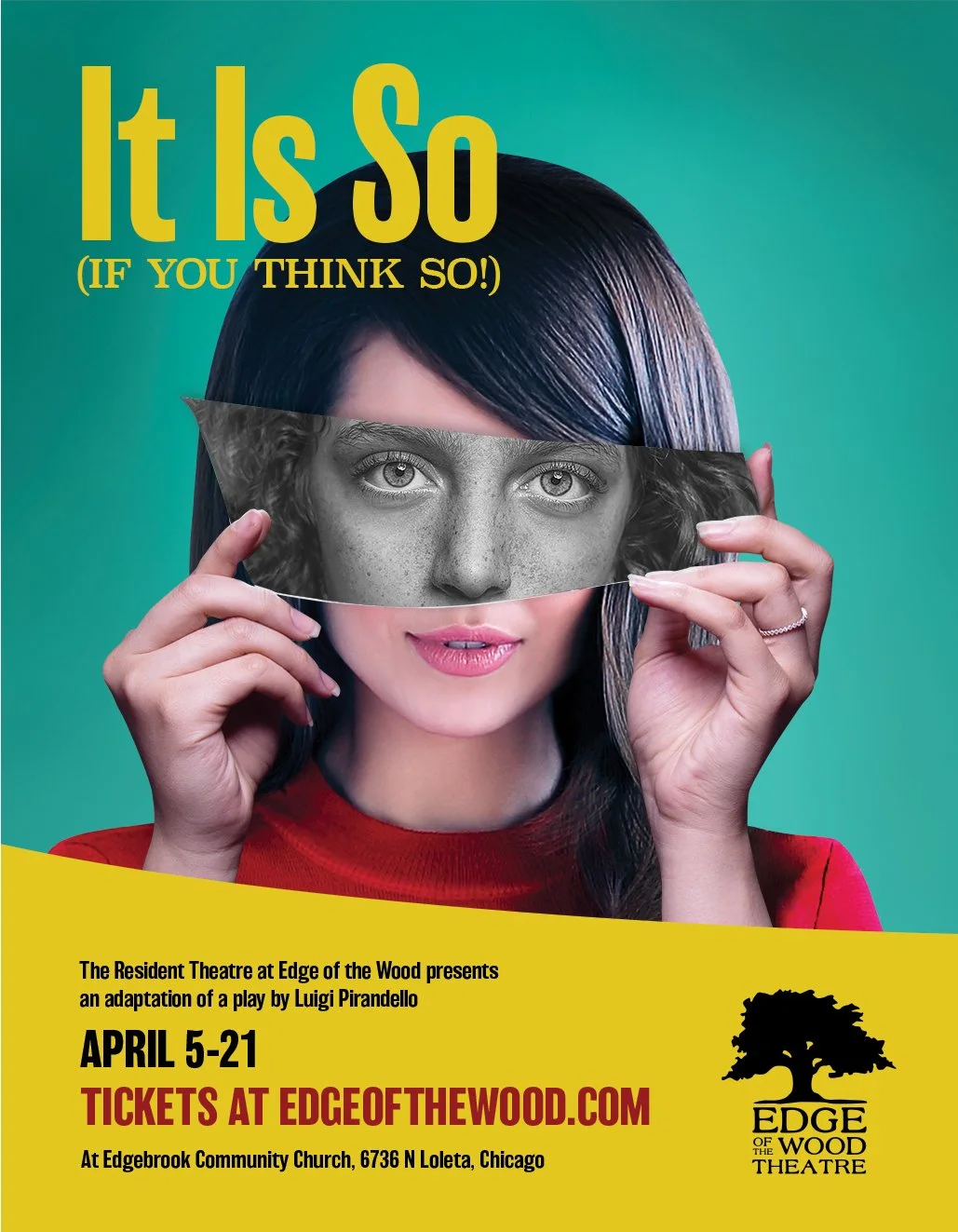
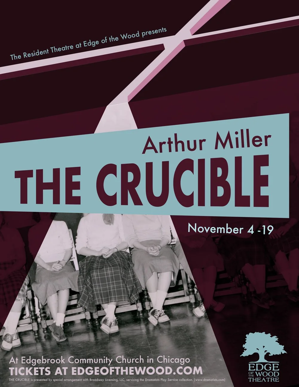
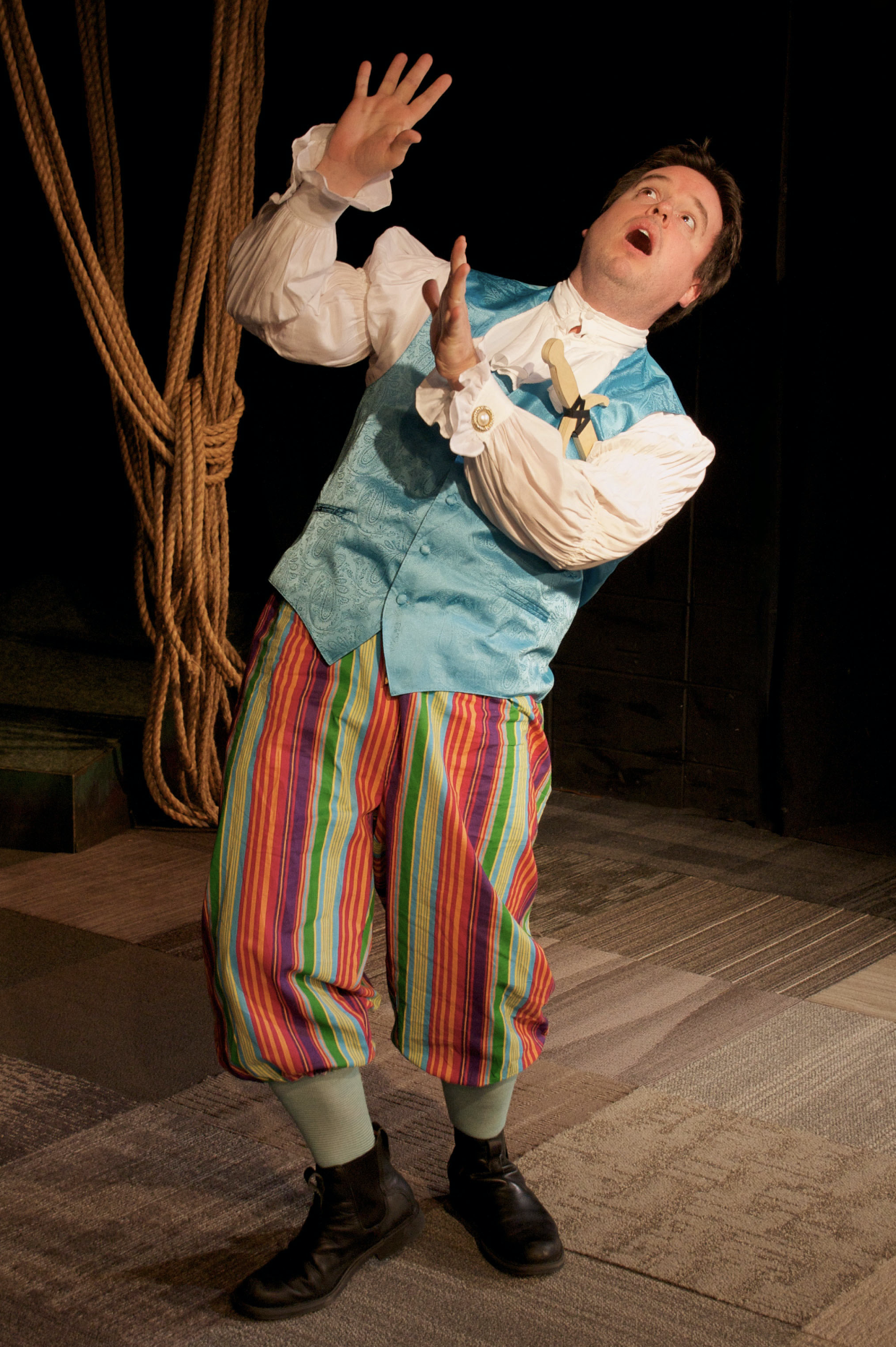
As a resident artist at The Resident Theatre at Edge of the Wood I wear many hats, among them directing, acting, and even occasionally prop and lighting design. But always graphic design and photography, and including posters, programs, postcards, photography, digital and social media creative, and environmental displays.

Result: engaging visuals across digital, print, and environmental that capture the ephemeral, magical nature of theatre and inspire investigation into its great stories.

Design and photography: Stacey Lind

The Resident Theatre at Edge of the Wood brings professional-caliber theatre to the Edgebrook community, and engages and inspires young people as performers and theatre-goers.
Phenomenal
— Lt. David Haynes, WGN Radio
 
paul-green-mln2ExJIkfc-unsplash.jpg

Team spirit

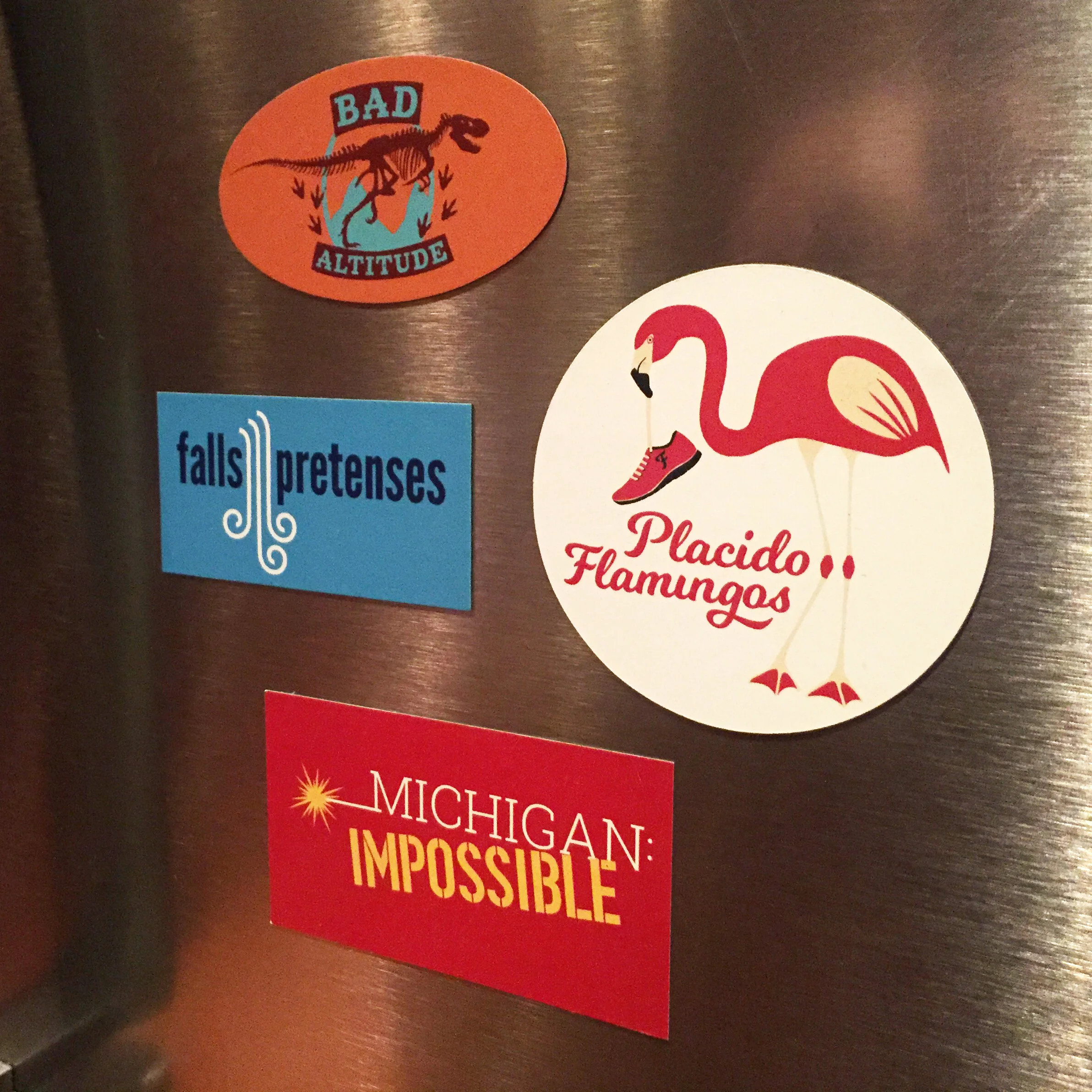
What fun is a 12-person relay team without a punny team name and swag to match? Featuring Ragnar teams Falls Pretenses (Niagara), River Deep Runner’s High (Great River), Bad Altitude (Colorado. That’s an allosaurus, in case you’re wondering.), Passage Aggressive (Northwest Passage), Michigan Impossible (Michigan), and Placido Flamingos (Lake Placid).

Result: spirited team souvenirs that still get used years after the event.

Design: Stacey Lind

 
whoisbenjamin-DpfqwV2edUM-unsplash.jpg

Social funk

4C wanted to highlight the sometimes surprising ways their affinity targeting could find ideal consumers brands didn’t even know they were looking for. That guy who races go karts with his watermelon helmet? We’ve got him covered.

Result: entertaining digital campaign that playfully reminded prospects of the specificity and depth of 4C’s audience targeting.

Design: Stacey Lind

girl-with-red-hat-h-6w7HwZRdg-unsplash.jpg

Mishmosh

Not a cool client name, but rather a random sampling of work from days gone by.

Design: Stacey Lind

Part of a spread for an after school program lookbook for WMCAT.

Part of a spread for an after school program lookbook for WMCAT.

Part of an audio tour map for the DIA.

Part of an audio tour map for the DIA.

Logo concepting. As yet unrealized.

Logo concepting. As yet unrealized.

Walkaround art installation map for the DIA’s Inside|Out program.

Walkaround art installation map for the DIA’s Inside|Out program.